The Rogue Banner Problem: Why Creative Drift Costs UK Brands More Than They Think

You can spot it from across the room. A sponsored post in the feed with a logo that looks slightly squashed, a headline in a font you don't use, and a colour that's almost your blue but not quite. It isn't a catastrophe. It's just... off. And that's exactly why it matters.
Creative consistency isn't about making every ad look identical. It's about making sure every ad looks like it came from the same business. For UK SMEs running campaigns across several hands — in-house, freelancers, a printer, a local radio rep, a paid social specialist — that's harder than it sounds. One rogue banner can undo a year of careful brand building, not because buyers consciously analyse it, but because inconsistency creates a small, nagging doubt. And doubt is expensive.
Why one odd ad punches above its weight
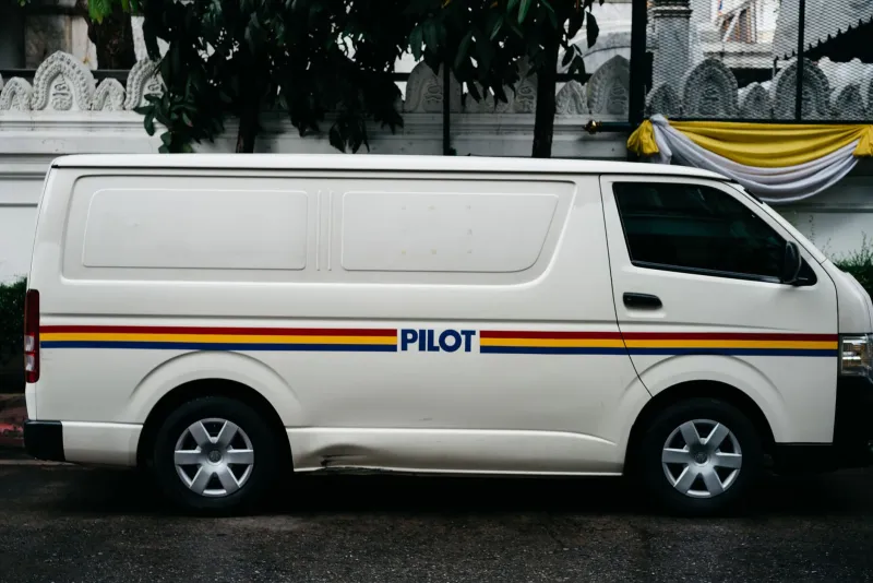
Brand recognition is cumulative. Every touchpoint adds a tiny layer of familiarity: the van with the right livery, the local magazine ad with the familiar headline style, the Instagram post that sounds like a human being rather than a press release. When one of those touchpoints breaks the pattern, the brain notices the mismatch before it notices the message.
That mismatch does two things. First, it weakens recognition. If your blue is sometimes navy, sometimes cobalt and sometimes a printer's best guess, buyers have to work harder to connect the ad to you. Second, it creates doubt. If the banner looks rushed, what does that say about the service? If the claim sounds vague, what does that say about the proof? The bad ad itself may be small. The question it plants is not.
This is the one bad apple rule: a single off-brand piece can spoil the barrel, not because it's the loudest thing in it, but because it's the one people remember when they're deciding whether to trust you.
The usual suspects are usually not villains
The rogue ad rarely comes from someone trying to damage the brand. It comes from a hand-off. A junior marketing manager builds a last-minute paid social ad from a template they found online. A freelancer writes a headline in a font they had on their laptop. A printer substitutes a paper stock and the colour shifts. A local radio rep writes a sponsor read in a tone that sounds nothing like your website. A sales team orders a banner for an exhibition and sends the logo as a JPEG.
None of these people are being careless on purpose. They're being fast. And speed without guardrails is how creative drift happens. The fix isn't to centralise every decision in one overworked marketing manager. It's to give everyone the same small set of rules — and a simple way to check the work before it goes live.
A guardrails pack small enough to actually use
Most brand guidelines are too long for the people who need them most. A 60-page PDF is fine for an agency pitch. It's useless when someone has 20 minutes to resize a banner. What UK SMEs need is a one-page guardrails pack: three fixed colours, two type rules, one tone note and five approved claims.
Three fixed colours
Pick three and give them hex codes. Not a palette of 12 with helpful suggestions. Three. For example: brand red, ink black and warm off-white. Then say where they go: red for calls to action, ink for headlines and body copy, off-white for backgrounds. If a piece needs a fourth colour, it needs a reason and a sign-off.
Two type rules
Keep it to two. Rule one: headlines are always the same weight and style. Rule two: body copy never drops below a set size, and line spacing stays consistent. Add a practical note: no more than two weights in one layout, and no all-caps sentences. That's enough to stop most DIY design drift without turning the brand into a straitjacket.
One tone note
Write one sentence that captures how you sound. Not a list of 14 brand values. Something like: "Warm, direct and specific. We say 'we', not 'solutions provider'. We explain the next step." Pin it above the desk. Put it in the shared drive. Use it when someone drafts a social post at 4pm on a Friday.
Five approved claims
This is the quiet hero of the pack. List five claims the business can substantiate and use without a fresh legal review. Examples might include "family-run since 2014", "free UK delivery over £50", "30-day returns", "same-day dispatch before 2pm" or "made in Yorkshire". Then add a line: any claim outside this list needs evidence and sign-off. That single rule stops rushed social posts from inventing promises the business can't keep — and stops environmental or performance claims from drifting into risky territory.
The ten-minute pre-flight check
Before anything goes live, run this. It takes about ten minutes and saves a lot of quiet brand damage.
- Squint test. Does the piece still look like you when it's small, blurry or seen from a distance?
- Colour match. Are you using the three fixed colours, with the right one doing the heavy lifting?
- Type check. Are the headline and body styles following the two type rules?
- Tone read-aloud. Read the copy out loud. Does it sound like a person from your business, or a leaflet from nowhere in particular?
- Claim check. Is every claim on the approved list, or backed by evidence and signed off?
- Logo breathing room. Has the logo got clear space, or is it crammed into a corner next to a QR code?
- Channel crop. Does it work in the actual placement — a 48-sheet near Leeds, a local magazine A5, a paid social square?
- Contrast and accessibility. Can people actually read it? Pale grey on white is not a brand style; it's a hiding place.
- Next step. Is the call to action obvious, and does the URL or phone number work?
- One owner. Has one named person signed it off? Not a committee. One person with the guardrails pack open.
What good looks like in the wild
A Bristol coffee roaster runs a local magazine ad, a paid social campaign and a roadside panel. The magazine ad uses the same three colours and headline weight as the website. The social ad uses a real photo of the roastery rather than a stock image of coffee beans. The roadside panel has one message, one logo and one URL — no QR code fighting for attention. Nothing looks over-produced. Everything looks related.
That's the goal. Not sameness. Consistency with enough room for creative ideas. The guardrails pack doesn't stop a freelancer from writing a sharp headline or a printer from suggesting a better paper stock. It just stops the brand from becoming a series of almost-right pieces that never quite add up.
One bad apple doesn't have to spoil the barrel. But someone has to check the barrel before it ships. A one-page pack and a ten-minute check are usually enough.