The Thumbnail Test: Why Your Brand Has to Work When It's Tiny
A logo that looks confident on a pitch deck can turn into a smudge in a social avatar. That is not usually because the design is bad. It is because the asset was built for one size and then forced into another. In UK SME marketing, this happens everywhere: the round social profile crop, the side of a Transit van, the back of a small packaging label, the event stand seen from twenty metres away. The cost is not just aesthetic. Every time a customer has to squint, you have added friction to recognition.
The smallest screen is now the first impression
Many people will meet your brand at 48 pixels before they ever see a billboard, a brochure or a shopfront. They will see it in a social avatar, a Google Business Profile image, a favicon, an invoice footer or an email signature. If your mark depends on a thin strapline, a delicate flourish or a wide wordmark, those details will disappear first.
A useful exercise is to shrink your logo to 64 pixels, then 32 pixels, then favicon size. Put each version on a plain background and on a busy photo. If you cannot recognise the brand without knowing what it is, you have a hierarchy problem, not a size problem.
Four places where UK brands get squeezed
Social avatars
Most platforms crop to a circle or a rounded square. Wide logos lose their edges. Straplines become unreadable. The fix is not to cram everything in. It is to create a compact mark or monogram for small spaces, while keeping the full lockup for banners and documents. A good avatar should work as a shape before it works as a sentence.
Van livery
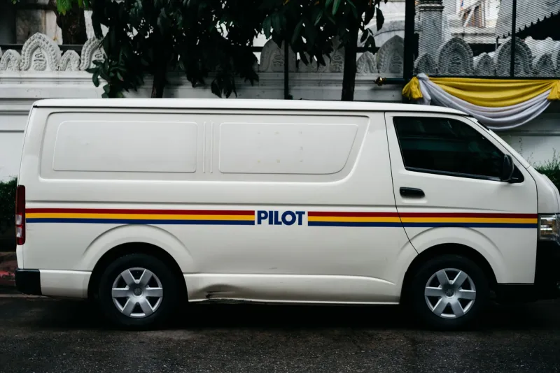
A white van is not a moving letterhead. It has panels, handles, wheel arches and sliding doors. A horizontal logo stretched across the side will get interrupted by real life. Design for the side panel as a canvas: one strong shape, a clear colour field and a phone number or web address that can be read at a glance. At 30mph, fine detail is just noise.
Packaging
Small tubs, bottles, boxes and shelf-edge labels are crowded places. Legal information, nutrition grids, barcodes and certification badges all want space. Your logo still needs to hold up at 15mm. Avoid white-out straplines and hairline type. Use colour blocks and simple shapes so the brand is recognisable even when the label is tiny.
Event stands
At a trade show at the NEC or ExCeL, people see your stand from twenty metres before they see your brochure. A full logo with tagline can become a pattern on a backwall. Use a repeatable icon and one clear message. Treat the stand as a distance tool, not a business card enlarged.
Cropping is not the crime — designing for one size is
Cropping only becomes a problem when there are no rules for it. A flexible brand system should include several versions of the same identity: primary lockup, compact mark, wordmark, icon, favicon, single-colour version, reversed version and stacked version. Clear space should be defined as a proportion of the logo, not a fixed number of millimetres that breaks on a small label. Type sizes should be relative. The strapline should be optional, never essential.
This is where many SMEs get caught. They have one logo file, usually a JPEG on a colleague's desktop, and every new format becomes a negotiation. The answer is not a full rebrand. It is a modest asset clean-up: define the small-size variants, write down the minimum sizes, and stop stretching the same file into every corner of the business.
A quick asset-flexibility checklist
- Shrink test: Does the logo still read at 64px, 32px and favicon size?
- Squint test: Step back five metres or blur the image. Is the shape still recognisable?
- Crop test: Place the logo inside a circle and a square. Does the core survive?
- One-colour test: Does it work in black, white and a single brand colour?
- Background test: Try it on a busy photo, a coloured van panel and kraft board.
- Distance test: View the event stand from twenty metres. Can you catch the message?
- Rules test: Are minimum sizes, clear space and approved variants written down anywhere?
The red apple lesson
A simple silhouette, a strong colour and very few details can survive almost any format. Not every brand can be that restrained, but the principle holds: build a minimum viable brand — the few cues that still work when everything else falls away. If only one cue could remain, what should it be? Colour? Shape? A distinctive letterform? Decide that first, then design the flexible versions around it.
Where to start this week
Pick five of your smallest brand placements. Print them at actual size and stick them on a wall. Ask a colleague who does not work in marketing to identify the brand from two metres away. Then fix one asset: the avatar, the van door, the label or the stand. Update your brand guidelines with the sizes you actually use, not the sizes you wish you used.
Small formats are not lesser formats. They are where recognition is won or lost. A brand that works at 16 pixels can afford to be expressive on a billboard. A brand that only works big is not really a brand system — it is a poster waiting to be cropped.